In this article I want to tell you the story about how DSbuilders is evolved from initial version with particular reference to card design. I think this is helpful to understand how creating a game can be complex like writing a book.
I started working on this game in March 2019, after a couple of PI Planning sessions with a SAFe ARTs. During those situations I noticed teams were struggling in collaborating and we were not able to engage people in the right way. SAFe is very clear about objective of PI Planning and defines a very precise agenda, but actually there is no clue on how to make people working. The reason is because this is based on experience and ability of the team members more than coaches’ one. What could we do to enhance this ability? A game obviously.
So I had the idea to create a situation where teams have a complex interlocked backlog of stories to let people test collaboration model fast and safe. Ideally this should be a serious game because we should have some fun to make this really effective (on the contrary it is like normal job) and should create some realistic, challengeable but feasible scenario where people can understand what they are going to do without worrying about build it.
So the idea to use Star Wars liked scenario.
The first draft of backlog (i.e. the set of all components to build) took around 2 months, obviously in spare time of my working days, and had a great impulse with the idea of arranging a meetup on team collaboration.
I was so focused on the backlog, but actually I had no idea on how to build 100+ cards. So I started to learn about standards (cards are poker sized so you can use standard products and services), tools and techniques.
Keep in mind the game now has 4 different type of cards (Components, Initiatives, Events and Roles, 135 cards), but at the beginning I focused on Components cards.
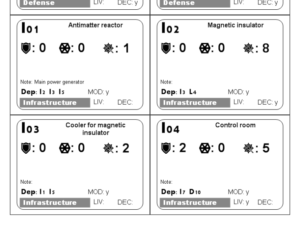 Here is the first version of the cards: a part from the basic graphic, logic of the connectors was completely different (here you can see 3 of them in the bottom right corner: “MOD”, “LIV”, “DEC”). However most of the information were already there and even with this basic format we were able to arrange the first sessions and in particular Play14 unconference where we manage 2 different sessions. Here we had a lot of gamers and I collected a lot of feedback that bring the second version.
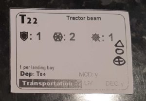
This card on the right in particular is just from the second session of Play14 where I introduced the new version of the connectors literally drawing them on the card. Good or not this prototype created during a night was good enough to be successfully tested.
Next time if you will be asked for an example of MVP you can mention version 1 of DSbuilders.
With all feedback collected I approached version 2 and we tried to experiment colours. Even if main graphic goal was to concentrate most of information in the top of the cards to optimise distribution of the cards in the mission board.
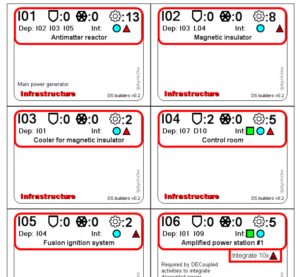 The colour experiment was not really successful, also because I think colour shouldn’t bring any information. So, ideally, cards could be printed also in greyscale.
Here I added the second evolution of the connectors, directly based on the feedback collected from players till that moment (100+ people have been already involved).
Connectors looked like the weakest feature of the game: apparently players were not able to understand how these were working. In the image on the right you can see in the card I06 how the “connector producer” card is differentiated from the other components cards. Also connectors switched to actual 4 types.
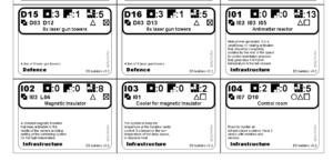
On the right you can see the true version 2 of the cards. Design of the card now looks more linear: I created specific icons for Defence, Supremacy and Complexity and I integrate the new connector icons. As you can see cards are still grey-scale.
In this version I also review dependencies: few mistakes were fixed and some more logical connectors have been created. Finally I introduced at later stage the 3rd improvement on the connectors: tokens.
This version has been developed for a series of workshops between October and December (here is one), planned as follow up of the successful September sessions. And obviously I collected more feedback, but also I started thinking that the game was almost ready to go public.
Finally the new version of the cards that have completely redesigned with metaphor of the “blue print”.
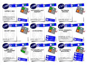
As you can see here graphic review was the main improvement, even if I added few more ideas to improve collaboration and make this more realistic (for example the adoption of the alien alphabet). Now design looks more professional and with the 3D boxes with shadows gives an idea of a working desk.
There is also a special Star Wars themed version.
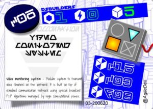
Is this the final version?
Let’s start collecting feedback and we will see, for sure I have in mind some expansions.
Anyway this will be the version I am going to use for my workshop at AgileTour London 2020 in October.
Are you ready to conquer the galaxy?